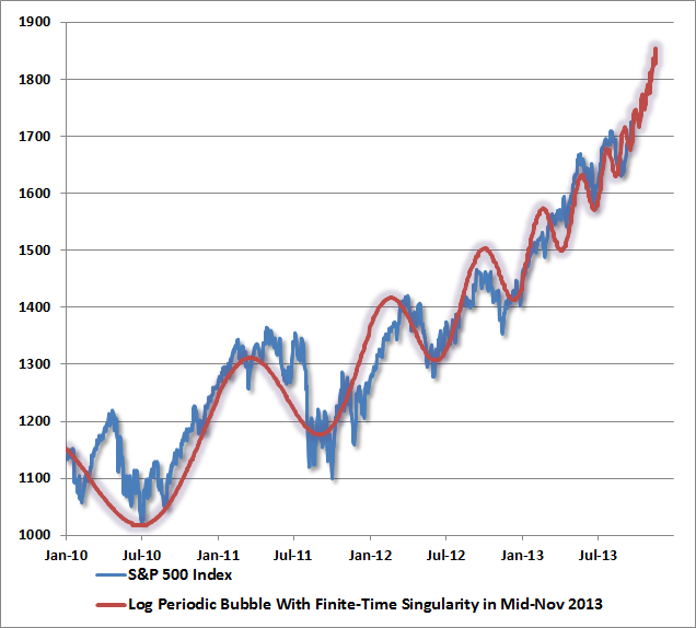
John Hussman
posted this chart. He calls it log periodic behavior. What he means is the short term variations are imposed on exponential asset growth. The exponential asset growth results from the compression of of the curve by the fed. Consider the equivalence between bonds and equities, the stable dividend yield should be comparable to an equivalent bond interest rate. What equivalent bond would that be? Well we know the relationship between transaction size and transaction rates meet the optimum flow conditions at equilibrium. So, large cap stocks should trade less often and in larger amounts then small cap stocks. The yield curve of a stock portfolio matches the yield curve of the fiat banker. Small cap, frequently varying stocks on the left, large cap slowly varying on the right. If the curve drops, the equity prices rise to make dividends match rates. If equity prices rise, that means they must match lower rates and
move left on the curve.
What have small cap and large cap stock been doing in the last five years? The small cap, SP600, increased by 10% annually over five years, the large cap. SP500, by nearly 7% over the period. Both are moving left on the curve, the small cap occupying more of the trade space relative to large. The Fed has kept the curve steep and compressed, and all the stocks want to operate to the left of the knee, where money is cheapest. But there is not enough space for them all, portfolios will have to delever, drop dimensionality to get them all to fit.
The Feds efforts to pump come with a cost, less trading space and reduced dimensionality (increased economies of scale in the market). The large brokers will delever, reduce the number of classes in their portfolios. That will cascade and cause a bubble collapse.
No comments:
Post a Comment