 And yet again we see that post war productivity was driving poverty down and LBJ's war on poverty was ineffectual. Yglesias claims he has found a new measure of poverty that shows a different effect, I am looking for the link.
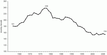
Next is the chart showing aid to dependent families.
When the programs were first introduced, the adherents can claim possibly a 4% drop from 1969 to 1979, but from then on these programs had little effect.
The summary: The proponents of the war on poverty can claim some initial success, but as the middle class begin to pay for these programs, the yellow line started rising and then the blue line started rising and finally, the poverty has spread to the middle class because of increased economic costs of these programs. But that's the problem, we just ding the middle class for payments, then soon we have no middle class. I still claim LBJ was a complete failure.
No comments:
Post a Comment