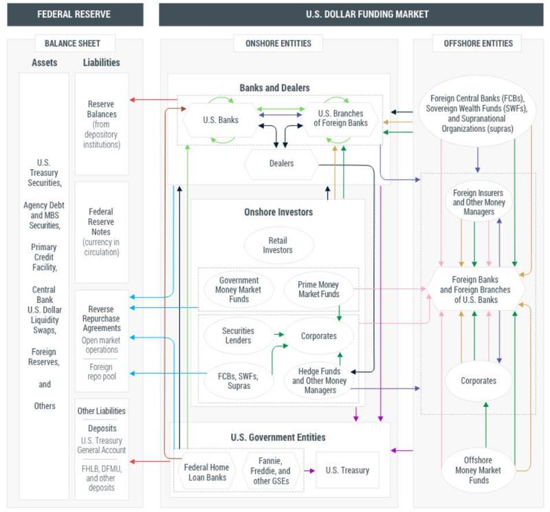
The debt flow graph used by the pro in the repo market.
Chart analysis is all about discovering when one of these flow steps gets congested.
In a normalized encoder form, this warps into a sandbox generator. We can convert this chart into a monte carlo generator, spewing typical sequences through the chart.
It also looks a lot like some of the quantum circuits I have seen lately. A Walmart inventory flow chart might look like this.
This is a value added net, as opposed to a complete market. Sandboxers can automate this. Sandbox can discover the network and rescale it according to supply and demand for liquidity. Our standard S/L standard pit handles this chart when transaction costs are isolated.

No comments:
Post a Comment